Spotify is rolling out a new look for iOS that ditches word-based buttons
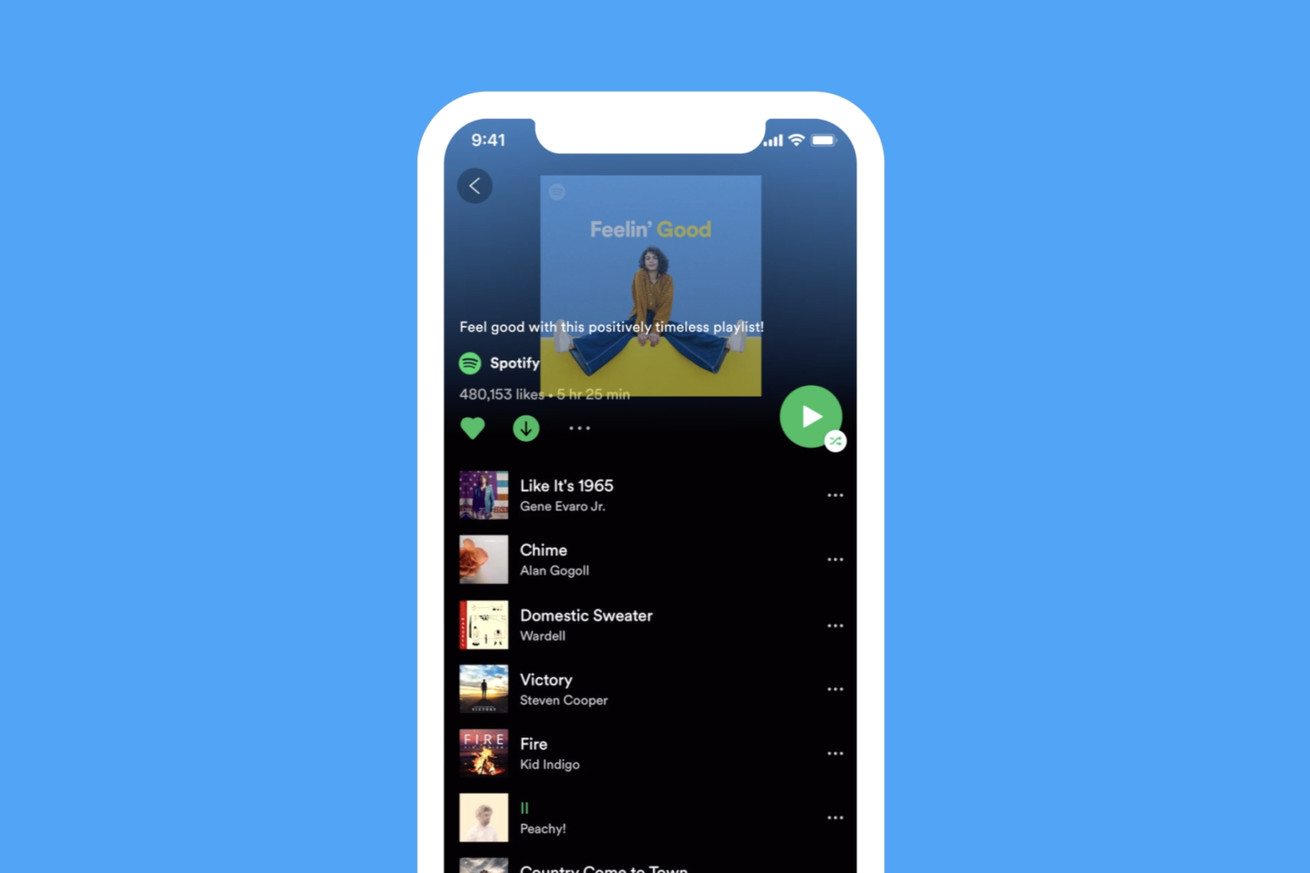 Image: Spotify
Starting today, Spotify is rolling out a new look to its iPhone app. The changes prioritize universal icons and visual indicators over written words, which Spotify says makes the app a more accessible experience for users all over the world.
First, Spotify has ditched the word-based “shuffle play” button that appears on an artist or playlist page. Now, it’s a simplified green button that contains both the play and shuffle icons. Other familiar icons have stayed the same but appear in new locations. For premium users, the “like,” “play,” and “download” icons will now be grouped together in one row in the central part of the screen. There’s also a new icon for downloading for listening without Wi-Fi; it’s the same one Spotify already has...


Comments
Post a Comment